Radix – Wallet Redesign
With over 100,000 downloads across iOS and Android, the Radix Wallet is the primary mobile application for interacting with the Radix DLT network. It allows users to create and manage wallets, transfer tokens, stake assets, and monitor their portfolio activity. This redesign was a proposal submitted to the official Radix team, aiming to refine the user experience, enhance navigation, and improve overall clarity while maintaining the established brand design language.
contextLaunched alongside the Babylon network upgrade, the wallet introduced new capabilities such as interacting with smart contracts and managing on-ledger personas. While the interface was visually clean and elevated many of Radix’s core features, the user experience revealed several friction points — especially around navigation, account organization, and content hierarchy. The goal of this redesign was to streamline these interactions and reduce user confusion without disrupting the existing design identity.
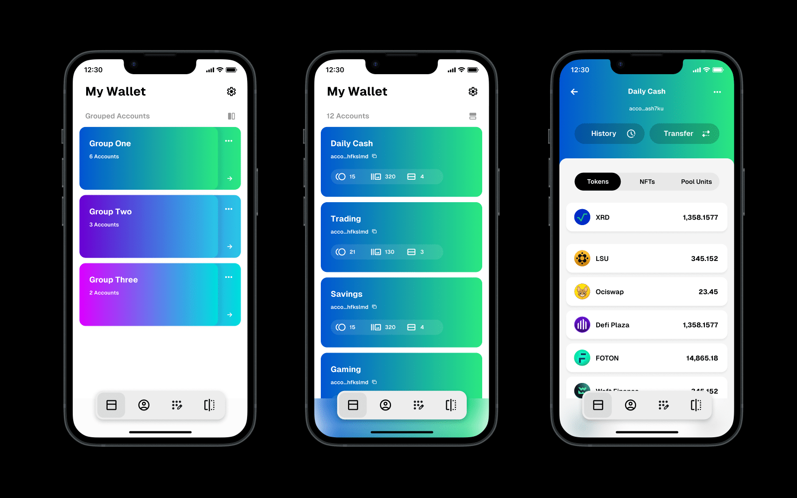
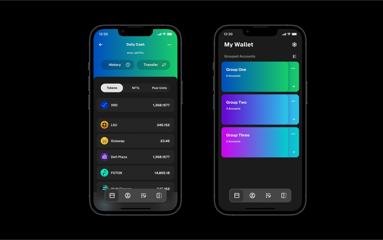
DesignAs both a product designer and an active user of the Radix Wallet, I began by combining first-hand experience with extensive community feedback gathered from social channels and user forums. Three key problem areas consistently emerged. The first was account management confusion — many users held multiple seed phrases and accounts, yet the wallet displayed everything under a single hierarchy, making it unclear which accounts belonged to which seed and leading to excessive scrolling. To solve this, I introduced a grouping system that allowed users to toggle between seed phrases and instantly view their associated accounts, creating a more structured overview and reducing cognitive load for those managing large portfolios.
The second issue was the lack of navigation structure. Without a persistent navigation menu, users had to repeatedly backtrack to return to the dashboard. While this approach maintained a clean aesthetic, it compromised usability. To address this, I reintroduced a bottom navigation bar featuring customizable shortcuts for essential actions such as Dashboard, QR Scanner, Connected DApps, and Personas, enhancing accessibility and enabling users to tailor their navigation to their habits.
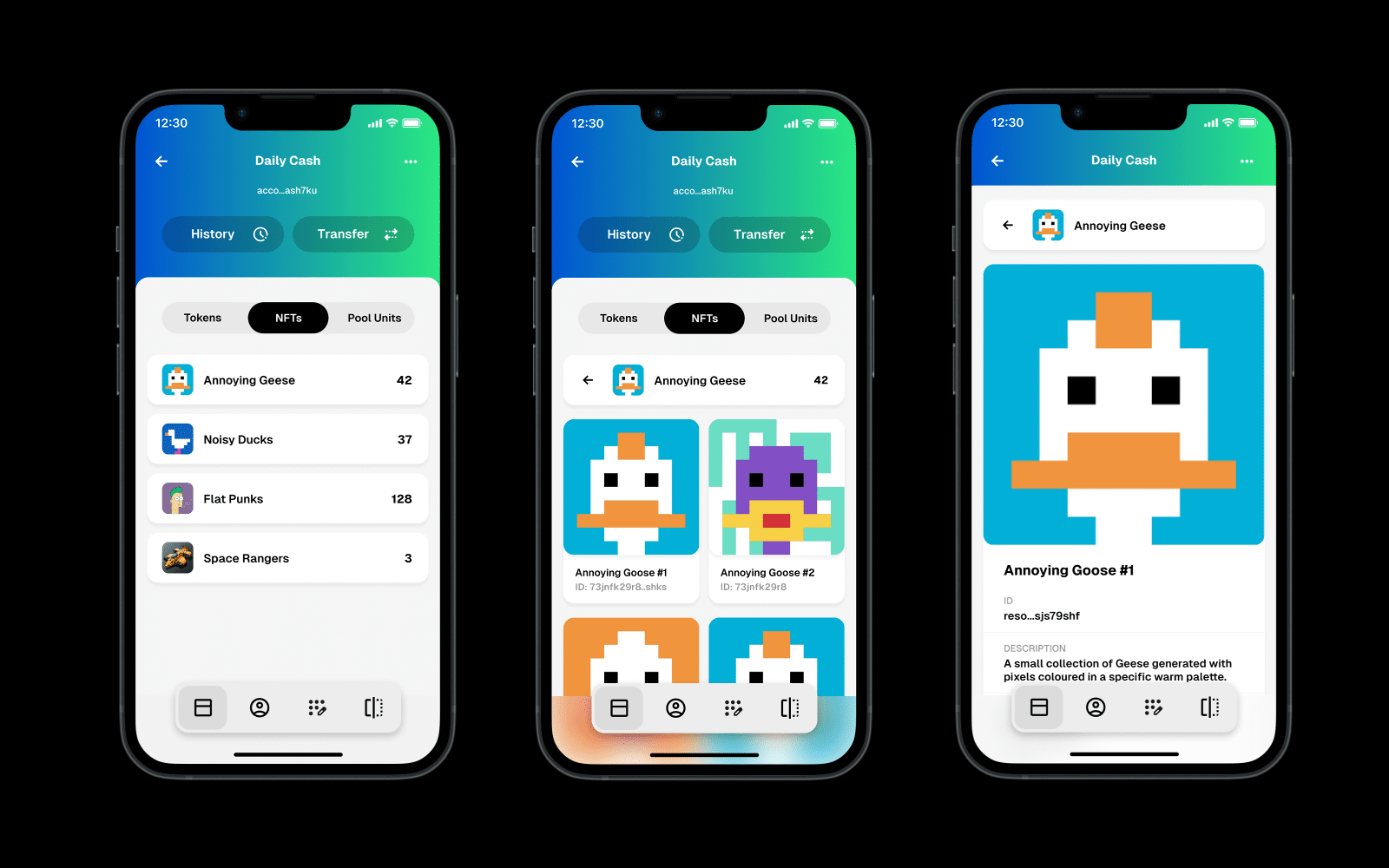
The third problem was inefficient NFT and badge browsing. Collections were displayed in a lengthy accordion format that made it difficult to scan or switch between items, especially in large sets. I replaced this with a grid layout, providing a compact, visually clear overview while allowing users to access full image previews when needed.
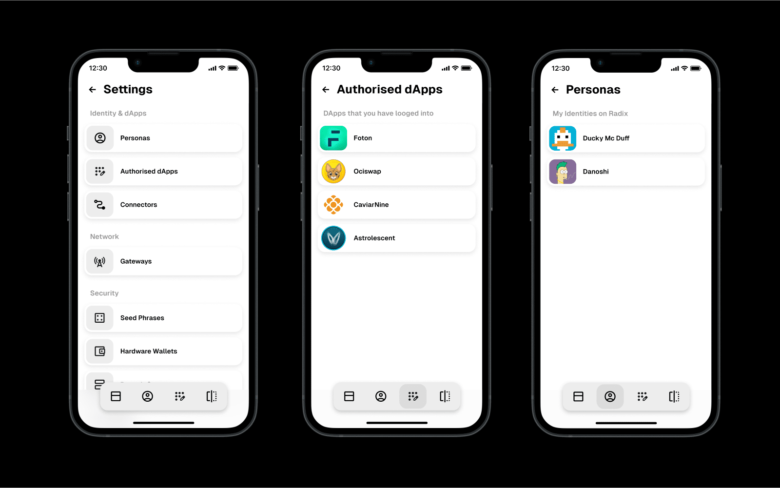
In addition, I refined the Settings panel, which had previously buried key options within multiple nested layers. The redesign adopted a more open, scroll-based layout, surfacing all important settings at a glance and dramatically simplifying navigation.
The second issue was the lack of navigation structure. Without a persistent navigation menu, users had to repeatedly backtrack to return to the dashboard. While this approach maintained a clean aesthetic, it compromised usability. To address this, I reintroduced a bottom navigation bar featuring customizable shortcuts for essential actions such as Dashboard, QR Scanner, Connected DApps, and Personas, enhancing accessibility and enabling users to tailor their navigation to their habits.
The third problem was inefficient NFT and badge browsing. Collections were displayed in a lengthy accordion format that made it difficult to scan or switch between items, especially in large sets. I replaced this with a grid layout, providing a compact, visually clear overview while allowing users to access full image previews when needed.
In addition, I refined the Settings panel, which had previously buried key options within multiple nested layers. The redesign adopted a more open, scroll-based layout, surfacing all important settings at a glance and dramatically simplifying navigation.
ResultsThe proposed redesign introduced essential structural improvements that significantly enhanced usability and user satisfaction. By addressing pain points in navigation, account organization, and NFT browsing, the new design offered a smoother, more predictable experience while staying true to the Radix visual identity. The result is a wallet that feels more intuitive, transparent, and aligned with user expectations — reinforcing trust and adoption across the Radix ecosystem.
Loopersanimation, nft, collection, art